What makes a data visualization dashboard effective?
They’re not the easiest tools to design from scratch. They need to display information and insights in the clearest way possible, and be interactive so that users can filter data and generate new insights. With so many factors to consider, it’s easy to get it wrong.
To help, we’ve made a series of detailed dashboard data visualization infographic examples to help you create the most efficient and user-friendly dashboards for your data. Using this guide, you’ll know precisely what goes into creating a custom dashboard for your organization’s needs.
What Does an Effective Dashboard Database Visualization Look Like?
To make a custom dashboard, you should first consider the role that dashboards play in your organization. A dashboard is an information hub that collects and displays data and visuals in one place, either on a desktop computer or a mobile device. Like other types of web and mobile applications, users can interact with the dashboard to display different types of information. For example, you can toggle between data filters to analyze the data from multiple angles.
The most effective dashboards look simple, but display very detailed information. They focus on just one area of business like mortgage production reports, commercial loan reports, or sales performance by product.
Narrowing the scope of your data visualization dashboard allows you to zero in on the insights that matter. It also makes the dashboard easier to read and use. Most organizations create multiple dashboards for every aspect of their businesses to keep their data organized and track vital metrics.
To create an attractive, informative interactive display, take a look at a few examples of effective dashboard data visualization infographics.
Examples of Dashboard Data Visualization Infographics
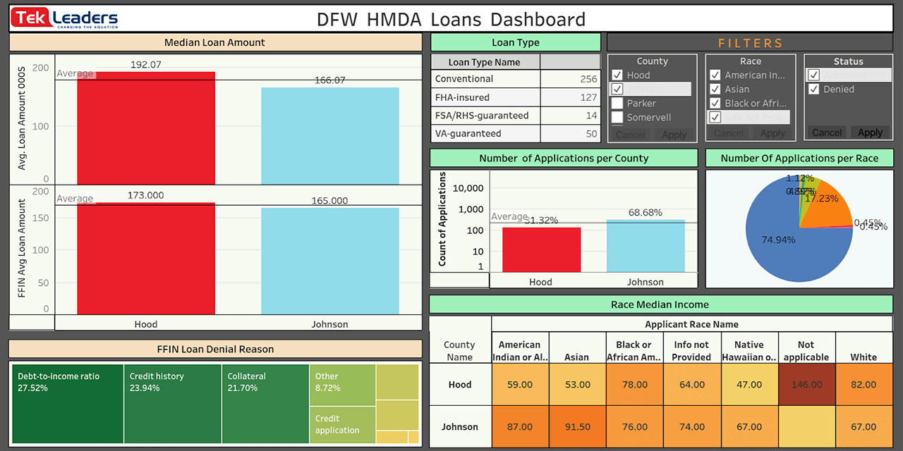
In the dashboard data visualization infographic below, you will see an example of an effective design layout that displays all of the information you need to identify patterns in a given dataset.
This particular dashboard focuses on mortgage loans as they relate to various demographics. Banks and lenders that use this dashboard can quickly see median loan amounts by demographic and more detailed breakdowns of loans by each dataset. This helps lenders serve their customers better and verify that they are following Home Mortgage Disclosure Act (HMDA) guidelines.
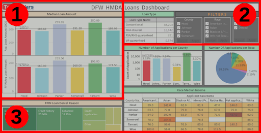
What makes this dashboard effective is that it follows three simple layout rules.
#1 The Main Visual: In the top left corner of the dashboard, we created a series of bar graphs that represent median loan amounts by demographic. Even if users only glance at this visual, they will understand the overall pattern that the entire dashboard is designed to track. This visual aid works as a summary of information. When you design your own dashboard, follow this basic layout: Put the most important and informative visual at the top of the page, preferably in the top left, since that’s where users usually look first.
#2 Filters and Interactive Components: Place data filters near or at the top of the dashboard alongside the main visual. Having these options at the top of the page is important for two reasons. First, users can immediately see that they have some control over the information being displayed. It encourages them to interact with the data. Second, it makes it easier to see how each filter affects the main visual and all of the other visuals underneath it.
#3 Supporting Visuals: Place all supporting visuals underneath the data filter controls and the main visual. Supporting visuals are any charts or graphs that show detailed information about a specific aspect of the data. For example, in the dashboard data visualization infographic above, we created visuals for:
- The most common reasons why loans were denied.
- The number of applications received in each location.
- The number of applications received per race.
- The median income of loan applicants by county.
None of these visuals are comprehensive enough to be the main visual at the top of the page. They only show you part of the bigger picture. However, having them in the dashboard is still important because you can use them to generate insights, such as why certain demographics receive more mortgage approvals or denials than others. You can then improve your business products and services in response to this data.
For example, you can see that Tarrant County (the green bar in the center visual) receives a higher number of applicants than average. Using this information, you may look into why so many applicants live in this county and what you can do to increase application rates elsewhere.
Every dashboard is different. The specific visual aids that you choose for your dashboard depend on a number of factors including your business strategy and the type of data you collect. Experienced data scientists and dashboard designers can help you identify the best visuals to use.
How to Create Dashboard Data Visualizations
The main challenge of creating a dashboard is selecting the right visuals for each dataset. To do this, you must think carefully about your business strategy and the goals of the dashboard.
In the dashboard data visualization infographic above, the visuals are designed to track every aspect of HDMA guidelines, including income, race, location, and reasons for application denials. Every visual has a specific role in this process.
- Applications visual works best as a bar chart because users need to quickly see how many applications they’ve received from each county and whether this is below or above average (marked by the thin grey line).
- Applications by race visual works best as a pie chart because this makes it easy to see which groups submit the highest and lowest percentage of total applications.
- Loan denial reasons visual features boxes that vary in size and hue to signify how many applications were denied for each specific reason. In this case, you’ll see that debt-to-income ratios are the most common reasons for denial across all counties.
- Median income by race visual is shown as a heat map graph, allowing you to see which groups have the highest and lowest income in each county.
Having more than one type of visual in the dashboard makes it more engaging and helps you sift through data more effectively. However, understanding how to display each dataset or metric involves some trial and error, especially if you’re not experienced with data analytics.
This is where a knowledgeable dashboard designer can help. When you hire a data analytics firm to create custom dashboards and visuals for your business, you won’t have to guess which visual aids to use. These firms often already have basic templates that track metrics related to your industry that they adjust to fit your organization’s workflow and preferences.
They can also design a new dashboard from scratch. With experienced data scientists on staff, the firm will know exactly which types of visuals are most effective. They also have advanced data analytics and visualization tools. This is a major benefit for small businesses or those that have limited budgets, with access to the world’s best visuals at a much lower cost. Partnering with the best dashboard consultants will help you connect more strongly to your data and find solutions to your organization’s most pressing issues.
Contact Tek Leaders to design your own custom dashboard today. Our detailed and interactive dashboards harness the power of your insights and get immediate results. If you have more questions about our dashboard services, you can reach us by email directly.
Shashank Reddy Tummala.