You’re driving down a long stretch of highway and aren’t sure whether you should refuel now or at the next gas station about 30 miles away. You glance down at your car’s fuel gauge and see that you still have enough gas to get you through the next 50 miles, at least. So, you decide to drive on.
Database dashboards work in the same way as vehicle dashboards. They display the most important information right up front so that you can make the best decisions.
However, unlike the dashboard of your car, your company’s dashboard database design is much more complex. In some cases, you have to display hundreds of numbers and dozens of metrics on a single dashboard to get the most accurate view of what’s happening.
Effective dashboard database design distills all of this complicated information down to its simplest and most visually-engaging form. There are six design principles that will help you get the most out of your dashboard:
- Base your design on business-related questions.
- Design for your end-user or audience.
- Select the most accurate visuals.
- Tell a story in the design.
- Keep the graphic elements simple.
- Use color to your advantage.
By following these six tips, you’ll create a beautiful and interactive dashboard database design to drive all of your future decisions.
How to Get the Best Dashboard Database Design
Tip #1: Ask Questions Upfront
One of the biggest mistakes that companies make when they create dashboards is that they try to cram too much information onto a single page. This results in an overly-complicated dashboard that doesn’t tell you what steps you need to take to make your business more successful.
To prevent this, start by asking what you want to achieve with your dashboard database design. Asking business-related questions helps you to drill down to what’s important. Your dashboard will answer these very specific questions, rather than attempting to cover everything all at once.
Examples:
- How many new customers did we get this month? How did this compare to last month?
- What are our top 10 products? Why are these products so popular?
- How is our marketing team performing? How do we improve performance?
The more specific the questions, the more effective your dashboard database design will be. You’ll see exactly which metrics to track to get the right answers.
Tip #2: Design for Your Audience
Once you have a list of business-related questions you’d like to answer with your dashboard database design, consider who is going to look at the information. Is your audience a group of employees or your CFO? They’ll want to see different things in the design.
For example, upper management and stakeholders likely want to see big-picture figures that will help them steer the company in the right direction. If you include daily operational metrics in the dashboard design, you’ll only muddy the waters and make their jobs more difficult.
Likewise, your employees want to know what they should be doing differently to reach their individual goals. If the dashboard is too broad in scope, they’ll struggle to see their roles in the company’s overarching strategy.
To decide on the right dashboard database design for your audience, choose one of the three most popular dashboard styles:
- Strategic dashboards for tracking individual goals and Key Performance Indicators (KPIs).
- Operational dashboards for managers to monitor systematic efficiency, like time to market or equipment maintenance records.
- Analytical dashboards for tracking larger market trends and big picture KPIs that stakeholders want to see.
All of these dashboards are designed with similar layouts but different visuals and metrics.
Tip #3: Choose the Right Visuals for the Job
Visuals can be misleading. For example, if you’re missing key data sets, then the visual representation of the information won’t be accurate. Another common problem is choosing the wrong type of visual to display the data.
To prevent this problem, your dashboard database should have access to all of the data you currently have in storage. Your in-house IT team or a third-party dashboard database designer can help you connect your data warehouse or cloud storage source directly to the dashboard.
You should also choose the best visual representation for each data set. There are four main types of visuals:
- Comparisons that show the difference between two or more sets of data;
- Relationships that show how two or more sets of data correlate;
- Distributions that group data by commonalities or values; and
- Compositions that break data down into new categories, so you can drill down to get a more detailed look.
The best dashboard database designs feature a combination of these four types of visuals. By analyzing the data from multiple angles using a few different custom visuals, you’ll get a much fuller picture of what’s happening at your company.
Tip #4: Tell a Story in the Design
What’s the best way to organize all of these visual elements on the dashboard? You should structure the information like a news story.
This means placing all of the most important data at the very top of the dashboard. Even if the stakeholder or employee only glances at the information at the top, they’ll understand the key insights. Your supporting visuals then go under these essential visuals—they are more detailed and enrich your understanding of the data.
For example, a well-structured dashboard database design includes:
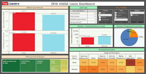
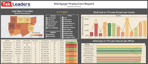
- Top visuals: Big picture insights (e.g. a heat map showing total mortgage amount by county);
- Middle visuals: Trends that support these insights (e.g. a line and bar graph comparing total mortgage amounts to goals set earlier in the year); and
- Bottom visuals: Individual performance KPIs or operational details that lead to the figures above (e.g. a chart showing individual loan officer performance).
When you structure your dashboard database design in this way, you make it easier for people to connect with the data through compelling visual storytelling.
Tip #5: Keep it Simple
It’s easy to get carried away when you design a new dashboard from scratch. Many organizations pack as much information into the dashboard as possible because they believe it will lead to better insights. However, the opposite is usually true. Too many visuals or data sets on the page will only confuse people and make it harder to see what truly matters.
A clean, simple dashboard database design is most effective. Not only does this make your dashboard look more polished and professional, but it also is easier to use on a daily basis. Users know exactly where to input data or filter results. They also know where to find crucial information so they can take immediate action.
Include no more than about five to ten visuals or widgets on a single dashboard. Your entire dashboard should also fit on a single screen without requiring users to scroll down. This allows them to see everything at once. It also makes it easy to adjust data filters and see how the visuals change in response.
Tip #6: Make it Colorful
Cohesive color schemes serve two purposes in dashboard database design:
- They make it easier to quickly understand the data on display.
- They lend the dashboard a more professional look.
For example, if you color-code the data so that profits are shown in green and deficits are shown in red, stakeholders will instantly know whether the figures are overall positive or negative. You can also show different gradients of color to represent information, such as in heat maps.
You also have the option to choose background colors that match your company’s logo or official color scheme. When presenting this information to stakeholders, potential investors, or others outside of your organization, this makes your dashboards and reports look more authoritative.
How to Create the Best Dashboard Database Design
Dashboard database design is both a science and an art. You need to be familiar with how to link the dashboard to data sources, program interactive components, and create innovative visuals based on data science best practices—but you also need to weave a compelling story and make a beautiful, user-friendly dashboard.
Combining all of these traits can be time-consuming and challenging, particularly if you don’t have a data science or graphic design background. By hiring a third-party dashboard database designer, you’ll save time and effort. Dashboard experts will:
- Connect all of your data to the dashboard;
- Build a dashboard that answers key business strategy questions;
- Choose the most appropriate visuals for each data set; and
- Customize the dashboard based on staff workflows and your business philosophy.
Having a fully-customized dashboard built by data science experts lets you identify the key insights and trends that will help your business blossom.
If you’re ready to build aesthetic and functional dashboards for your organization, contact Tek Leaders today. We create custom dashboard database designs from scratch that help organizations gain valuable insights. If you have more questions about our design process, you can reach us by email directly.
Shashank Reddy Tummala.